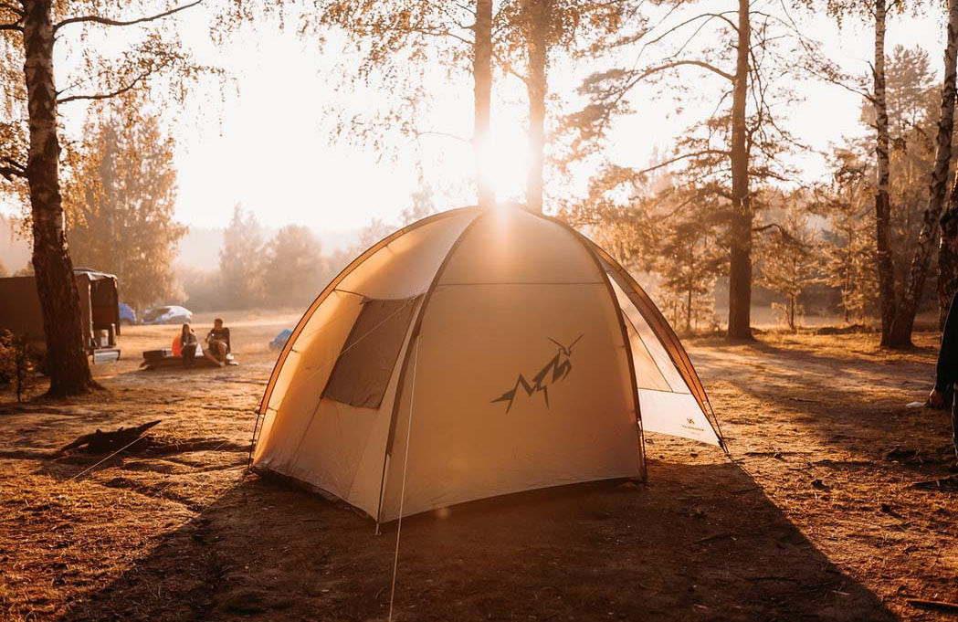
Hiking is looking, exploring and being in constant motion. The praying mantis was chosen to represent hiking equipment because it has all these characteristics.
First attempt

The praying mantis has a complicated structure due to its many angles.
At first, I tried to soften the outline by using rounded lines. However, the nature of the praying mantis was lost.
Second attempt

Third attempt
In the second sketch, I used shaded regions in different tones of black. Although I liked the result, I wanted to check a third option of increasing the number of angles.

The third option was the one that caught the essence of the logo, but work was still needed in order to reduce the number of lines. A balance had to be found between the complexity of the praying mantis and the minimalism of a logo.
Final logo
The praying mantis looks in motion as if in the middle of a hike.
The look on it's face is inquisitive much like that of an explorer
The space between the legs resembles mountains